Animating an SVG Logo in pure CSS
In this article, I’ll show you guys how I created an animated logo for my personal website https://weshuber.com/ with a simple SVG illustration and a few CSS animations.
To start, you’ll need to create an SVG. To do this, I used Adobe Illustrator, but you can also find free online tools such as https://www.svgator.com/ where you can create SVGs for free. SVGator offers animation on their pro plan, but don’t worry about that, just create your basic shape and export the static SVG, we’ll do our animations ourselves later.

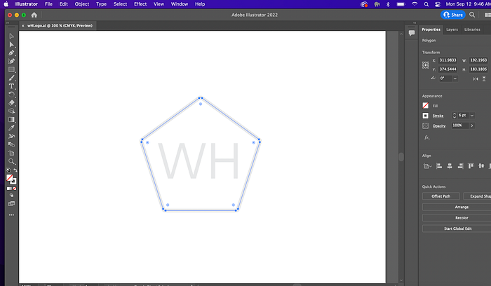
For my SVG I created a pentagon with my initials inside of it. For animating, the simpler / less elements there are — the easier and more basic the animating.

Once you have your exported .svg file, open that up in your favorite code editor — I use Visual Studio Code — or just simply open the file in textEdit (mac) or notepad (windows). You could also open it up in CodePen!
You’ll see a bunch of XML and depending on what software exported your file — it may be kind of confusing. Take some time to format the XML (use tabs and ENTER key) and make it readable.

You should see some <path> tags in your XML, these are the shapes that we are going to animate. Add a class or ID to them if they do not have it already.
In my case the class “d” is the Pentagon shape and “e” are the two initials WH inside of it.
In order to animate, I used CSS keyframes along with the stroke-dasharray and stroke-dashoffset properties. These two properties give the “drawing” of the pentagon effect. I had to play with the two values in order to get it to start and finish where I wanted.

For more information on the stroke-dasharray and stroke-dashoffset check out a useful article here: https://www.cassie.codes/posts/creating-my-logo-animation/
The CSS animation properties “draw” and “fadeIn” are defined further down in my CSS code.

stroke-dashoffset: 0; makes the “stroke” line of the pentagon complete again. The fadeIn is used to bring in the initials from 0 to 100 opacity.
And that’s it! It’s a really simple animation but useful and it looks good. If this tutorial helped you at all you can show thanks by buying me a coffee :) https://www.buymeacoffee.com/wesleyhuber
If there are any improvements or you run into trouble let me know in the comments!
Thanks for reading y’all, peace out!
